Categories
MetaBlogging

Get even more out of FeedBurner

Guess who’s featured in today’s edition of MommyBrainOnline’s The Boost newsletter? It’s me! Welcome to new visitors! Please subscribe to MamaBlogga to get more posts on finding fulfillment and blogging tips!

It’s been a while since we went through the five easy steps to getting started and seven ways to get more from FeedBurner, the RSS service. Well, FeedBurner recently added a feature to help you get even more out of the service!

FeedBurner has offered email subscriptions for a while, for your blog readers who want to get updates in their inbox instead of in a reader. But while you could customize lots of options for your email newsletters, the subject line was always the same. For years, the only way you could make your email subject line change to match your content was to login every day and do it manually.

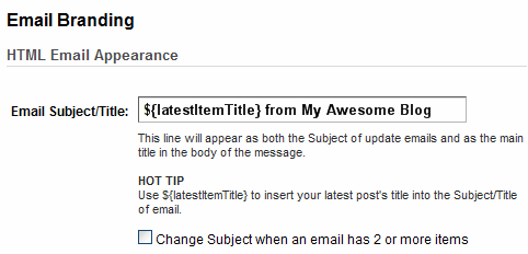
But that’s changed! Now you can add a custom feature to your subject line to make it match your post titles. Under Publicize > Email Subscriptions > Email Branding, here’s the new “hot tip”:

gooburner-custom-subject-line
Just add ${latestItemTitle} to your subject line, and the title of your latest post will appear in your subject line.

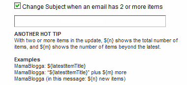
If you have more than one post per day, you can customize your subject line even more if you check the checkbox. A popup menu appears giving you even more options:
gooburner-custom-subject-line-mult

Why is this helpful? It will help your email subscribers see what’s coming in your email. It should also increase the number of email subscribers who actually open your email, since it won’t get lost in a sea of same-subject emails (like Darren Rowse of ProBlogger points out).

Here’s the official Google announcement of the FeedBurner change.

More Works-for-me Wednesday

So get out there and make your email newsletters even better!

Categories
MetaBlogging

New features coming for Blogger (available now in Draft)

Some of you know that in my “day” job, I’m an Internet marketing blogger. Occasionally, I come across something cool enough in my line of work that I have to share it with you here.

Last week, a Google-watching blog, Google Blogoscoped, reported this week on features coming up for Blogger—and a lot of them are pretty cool. Like other beta features (a search box, future posting), they’re currently available on the Blogger Draft site.

The latest features, ranked by order of coolness (IMO):

  • Comments form embeddedable below the post. Can you believe it? Soon (well, now if you want to switch to Blogger Draft) even Blogger blogs can have the comment form right on the post page, rather than a “Post a comment” link. Google Blogoscoped explains how to get this feature on Blogger Draft now: go “to Settings -> Comments, and in the Comment Form Placement segment check the “Embedded below post” box. Click Save Settings to approve.”
  • Integration into Google Webmaster tools. A link in the Dashboard takes you to Google Webmaster Tools. Now, you may not be familiar with Webmaster Tools (and if not, let me know and I’ll be happy to write about it!). The short story here is that Webmaster Tools helps you to interface directly with Google to see any problems with your site in the search engine index, to see keywords people use to find your blog in search results, and to see their click data (though I still recommend using a separate analytics package like Google Analytics). If you don’t want your blog listed in search engines, this isn’t really as useful 😉 .
  • Exporting and importing your blog. Not only will this make it WAY easy to backup your blog regularly, it may also make it easy to move to a new blogging platform if you so choose. Posts, comments, etc. will be downloadable as XML files. This is under Settings, as Import blog and Export blog.
  • A new post editor with new image handling. Google says, “When you upload an image to the new post editor it will appear as a thumbnail in the image dialog box. That way, you can upload several images at once, and then add them into your post at your convenience.” Very nice.
  • Star ratings. Personally, I don’t find this one as interesting, but it could definitely be useful for getting feedback from your readers on what kinds of posts they like. It adds a five-star rating system and readers can rate the post. You can then see the average rating for each of your posts. This feature is under Layouts, at Edit at your Blog Posts element. Select the Show Star Ratings box.

If you don’t want to switch between regular Blogger and Draft, you can now also make the Blogger Draft site your default dashboard. But if you don’t mind switching, you can make these changes in Blogger Draft now and still post from regular Blogger with the changes intact.

If you always want to stay on top of new beta-stage features for Blogger, head on over to the Blogger in Draft blog and you’ll always be in the know!

Categories
MetaBlogging

Creating category feeds

Do you read a blog that you love to see their posts about gardening, but could care less about their posts about dog grooming? You (or the blogger) can remedy this problem by offering category feeds, or RSS feeds (What’s RSS again?) of individual categories on a blog.

Most of us already know how to use categories on blogs—we use them on our own blogs to break the content up by major subject; we use them on other people’s blogs to learn what they write about, to navigate their content and to find posts on a particular subject.

The general convention for most blogs is “Categories” are the larger topics of the blog and “Tags” cover narrower topics or subtopics. Blogger, of course, just has to be different and use “Labels,” which usually seem to function as both categories and tags, since they don’t give you any other option.

By creating category feeds, you allow your readers to pick and choose which topics they want to read about. This could be good for you—you get to target readers who are most interested in this area of your blog, while not risking losing them because of the stuff that they’re not so interested in.

Creating Label Feeds in Blogger

from Blogger Design

To create a label-based feed on Blogger, the feed address is:
http://YOURBLOGNAMEHERE.blogspot.com/feeds/posts/default/-/YOURLABELNAME

Obviously, you’ll have to change the blog name and the label name to match what your blog. This will give you the address of an RSS or Atom feed that you can offer to your readers. Note that label and category feeds can be burned with FeedBurner.

Creating Category Feeds in WordPress.com and WordPress.org

For once, it doesn’t make any difference whether you’re using a self-hosted or WP-hosted flavor of WordPress. To create a category-based feed with WordPress, the feed address is:
http://YOURBLOGADDRESS.com/category/CATEGORYNAME/feed/ (or http://YOURBLOGADDRESS.wordpress.com/). (You have the option of using something else for the first /category/—some blogs choose to use /archive/, etc.)

You’ll have to change the blog address and the category name, but appending /feed/ to any category page (or, incidentally, any tag page, too) automatically gives the address for the RSS feed. (Want Atom? add /feed/atom/ instead.)

Once again, category feeds can be burned with FeedBurner.

Creating Category Feeds in TypePad

As I generally like to say, TypePad, being evil, makes this difficult—or at least relatively more difficult than the other standard platforms. However, if you can create a new index template as part of an Advanced Template Set (does that cost extra?), then you can create a category feed.

The full instructions are available from Six Apart, and require you to cut . . . and paste (can you believe it?!) and change the listed category to whichever category you’re looking for. Follow the directions carefully, and your feed will be at the address you specified when you created the new index template.

And, one more time, category feeds can be burned with FeedBurner.

Conclusion
This is, of course, an individual choice—but if your readers (or you as a reader) really want to, they can create these feeds (and even burn them in FeedBurner) themselves.

Please note that it would be wrong to “steal” another blog’s category feed and burn it, and especially to promote your burned version of the feed elsewhere on the Internet. I don’t think that any of you gentle readers would do that, but you never know what the Internets might bring in here.

More Works-for-me Wednesday
Categories
MetaBlogging

Handling negative comments part II

Maleficent doesn’t know anything about love, or kindness, or the joy of helping others. You know, sometimes I don’t think she’s really very happy.

—Fauna, Sleeping Beauty

It’s been a long time since I’ve gotten negative comments, but last week I had a few. Some were allowed to stay. But they progressively got worse and violated the written comment policy here on MamaBlogga and some were deleted.

While we’ve discussed handling negative comments here before, I’ve seen a few good posts on this around the blogosphere lately. Last month, ProBlogger had a guest post about dealing with negative comments. The author reminds us:

A good rule of thumb is that nasty or negative comments are never about you or what you’ve written, they are always about the person who wrote them. (Even if people disagree with what you’ve said, most of them can do it in a sane & respectful fashion.)

(Hence the quotation from Sleeping Beauty above.)

She addresses both the drive-by troll (“Delete their comment & if what they’ve said is really nasty, just ban them. You don’t need the strife!”) and the long-time commenter turned nasty (to whom she sends a friendly email).

Just last week, Scribbit posted about this issue, too. She said:

Be careful how you treat readers, even the negative ones. Not just for fear of them never returning—rude ones probably never will anyway—but because it’s common courtesy and because they’re people too with thoughts and opinions that won’t always mesh with yours and darn it, that’s what makes the world so exciting. Who knows? Maybe they’re even right once in a while.

She also included a very fun flowchart for guidance on whether to delete nasty comments.

On my work blog, I delete almost nothing but spam and blatant self-promotion—and I get a lot more nasty (and dumb) comments over there. I’m slowly learning to walk away from people who simply aren’t listening to me while trying to engage in a “debate” (though this would normally be called a “monologue”).

But here on MamaBlogga, a personal, mom blog, I can delete with impunity, and I have deleted more than just spam comments. I still feel a little weird about it sometimes, though. Do you have any qualms about deleting rude, mean or simply borderline comments?

Categories
MetaBlogging

Going it alone: blog design

This entry is part 5 of 5 in the series Blog design

If you have the technical and design know how to create and implement your own blog design, then this may be the route for you when you redesign your blog. Here are some tips and things to remember when creating your new custom blog design.

When creating your new design, keep in mind the subject matter, goals and theme of your blog. Try to match your color scheme, graphics and layout to those. If you aren’t sure how to do this, talk to someone (like your readers or a professional blog designer). Outside input can be hugely important in creating a blog design that works for you and your blog.

As I mentioned last week, a key feature to your blog design is user-friendliness. This bears repeating: “light text on dark backgrounds are very hard on your readers’ eyes. Having music, flashing text or graphics and/or scrolling text or graphics is also tough on readers’ (and their browsers).”

When working on your blog design, it’s a good idea to set up a test blog. If you’re modifying your current design, you can import that into your test blog to start. If you’re creating a new design from scratch, create it there first. Not only will this make sure that all your changes work with your blog software and layout, but you won’t risk “breaking” your main blog.

When creating your new design, go slow. By that I mean change just one thing at a time on your test blog. This isn’t just for aesthetic reasons: if you “break” something, you’ll know what caused the error. If you change six things in one edit and suddenly your test blog doesn’t work, you won’t know which of the things caused the problem.

However, be sure to try different things. I recently did a blog design with a color palette the client had chosen from ColourLovers.com. The palette was beautiful—but the way I used the colors on the page wasn’t. I could have redone the entire color scheme (which wouldn’t take that long), or changed the way I used the colors on the page, but instead I went hunting for more colors (back on ColourLovers) that worked with the “good” colors.

Other than new colors, here are some other small tweaks that can really change your blog’s feel (and the appropriate caveats):

  • Font face: make sure it’s easy to read and works across many different computers (not everyone has the same fonts preinstalled on their computer as you do!)
  • New header: I recommend not making the header so large that visitors can’t see at least your first post when the page loads. Also, be careful how wide you make it: not everyone has a widescreen laptop.
  • Layout: If at all possible, use your blog software’s options to change the number or layout of columns

Now I think I’ll take my own advice: Readers, what do you think of this blog’s layout, colors and graphics? Are they easy to read and understand? Do they match what you perceive as the purpose, goals and theme of MamaBlogga? I’m ready for your feedback (*braces self*)!

Categories
MetaBlogging

Should you do your own blog design?

This entry is part 4 of 5 in the series Blog design

You’ve decided that you’re ready for your own blog design and you want to get to work. But should you try to do it yourself? Here’s a little self-quiz that will help you decide if you should do your own blog design.

Do you have experience with a graphics program?
Virtually all layouts feature custom graphics, at least in the header. Do you know how to make one?

Do you have an idea on how to convey your blog’s theme graphically?
Does the color scheme, graphics and layout you’re thinking of make sense for your blog and its topic? Do you know how to make that statement graphically?

Do you know how to make a blog layout and color scheme user-friendly?
A few things to remember here: light text on dark backgrounds are very hard on your readers’ eyes. Having music, flashing text or graphics and/or scrolling text or graphics is also tough on readers’ (and their browsers).

Do you need to make substantial changes to the layout of your blog?
Do you want to go from two columns to three? Unless you have some coding experience, this can be a lot tougher than it looks.

Do you have experience with coding CSS and/or HTML?
CSS is the more important of the two; you can change the entire look and feel of your blog without touching the HTML.

Will your blog software let you make the changes that you want?
Be sure to check whether your blog software will let you use a custom, graphics CSS or layout.

If you have the technical skills to accomplish a new blog design, it can still be helpful to consult a professional to get an outside idea about how to best convey your blog’s theme visually.

If you decide to do it yourself, be sure to come back next week for tips on creating your own blog design!