Sure, you’ve got great posts, adorable pictures of your children, a custom header—but sometimes, despite the care we’ve put into designing them, our blogs can feel a little disorganized. Or maybe you’re just worried that visitors aren’t noticing the most important things on your blog.
Well, I have good news. Organizing the information on your blog can help make your site look and feel more put together—and you can feature your favorite stuff more prominently so all your visitors will understand your site.

How do people see your blog?
When organizing your blog, look at your blog as if you’d never been there before. What can you tell about your blog from the first glance. What is the blog about? Where does your eye go?
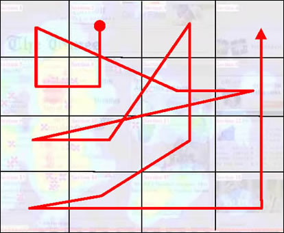
This is hard to do for your own site, so if you have a friend who really hasn’t ever visited your blog before, they might be a great help. But even if you can’t get that kind of help, there are certain established patterns that users’ eyes follow. Here’s one such pattern from the Eyetrack III study

Obviously, your header and possibly your top stories are important—as are your sidebars and navigation.
Make your sidebar hot
Note that after the upper-left, the next place most people’s eyes go is the middle right—where your sidebar is. So what do you want to put there? The most important thing you want on every page of your site. Something that will draw visitors in, explain your site, and get them coming back for more.
I use my subscribe link to encourage visitors to subscribe (one of the goals for my blog). I’ve also put links to popular stories and a brief explanation of what my blog is about over there. Also prominent in my sidebar: my search box. It’s one of the first features I need on many sites that I visit, and I hate to have to search for it.
Other things that might be good: something that will be a touchstone for your readers—like a Good Housekeeping seal of approval-type thing. If you want to promote ads on your blog, that’s a find place to do it, too.
What shouldn’t you put there? Well, putting your main site navigation (i.e. links to your about page, etc.) in your sidebar takes up extra room—and your navigation will be more effective somewhere else.
Make your navigation work
The same eyetracking study indicated that “navigation placed at the top of a homepage performed best — that is, it was seen by the highest percentage of test subjects and looked at for the longest duration.” Top navigation (i.e. right below your header, like in a menu bar) is the most effective way to display deeper information about your site.
So what goes here? Links to pages that explain your site, who you are, your blog’s major features, etc.—so pages like About and Contact, pages for any major memes or themes to your site, etc. Make sure that the words in the links are succinct and descriptive, so we know where to find the features to your blog and know what we’re clicking on.
Drawing your visitors’ eyes
I think most people intuitively know that content “above the fold” (in the area of the page that’s visible without scrolling down) gets the most eye-time. Once people start scrolling, they’re either engaged in the content—or scanning and searching for something to engage them.
So how do you get the scanners engaged? You can work to make your posts scannable using engaging headlines, graphics, bold text, etc.
And how about your sidebars? Take a look at your sidebars as if this is the first time you’ve visited your blog. What do you find most interesting? What do you find confusing, or not easy to understand immediately?
Some things in sidebars can be moved to separate pages to reduce the feeling of clutter in sidebars, such as:
- Awards
- Badges
- Blog rings
- Favorite posts
- Ways to contact you
If you create a page for your awards, badges, etc., you can still have a link in your sidebar so interested people can check those out, and you can still show off your memberships, but you can do it without overwhelming your visitors.
Believe it or not, a few changes in a short time can really change the way you and other people see your blog. So get organized!
More organizing tips from WFMW. Eye tracking study via ProBlogger.
Photo credit: Tread